DESIGN 3 FINAL ASSESSMENT TASKS
These final assessment tasks require a basic design concept to be developed, an exploration of the use of colour, selecting and applying type and deliver the work to required standards.
Assessment Task 1 - AGideas Flyer
Use InDesign to design a two-sided DL flyer for this year's conference AGideas 2015. The card requires a professional/contemporary feel that will appeal to designers and design students. The image, logo and copy are provided.
For this exercise I produced a trifold DL flyer, which was not quite what the brief asked for, but is rather excess to it. Nevertheless it does fold the the DL flyer size, but should have been a 99mm x 210mm two-sided card.


Assessment Task 2 - Colour Postcard
We all view colours differently and we have all had differing experiences in life. Take this as an open brief to show what colour means to you. Use whatever medium you like, images and or text. Demonstrate your impression of the colours of Australia. Optional text supplied.
- Produce a front and back for the postcard
- Use Photoshop to scan images and InDesign for layout
- Size of postcard: 148mm x 105mm
I decided to use some lines from Dorothea Mackellar's poem 'My Country' as it has epitomised a picture of Australia for me since learning it in primary school...
'I love a sunburnt country, a land of sweeping plains,
Of ragged mountain ranges, of droughts and flooding rains:
I love her far horizons, I love her jewel sea,
Her beauty and her terror - the wide brown land for me!'


D3 Learning Activity 10 - Anatomy of Type
Part A - Anatomy of Type poster
Through searching the words 'Anatomy of Type' we were required to create a poster in InDesign experimenting with layout and type to explain what we had learnt in Design 3 to date.

Part B - Hand-drawing type
The best way to understand the unique nature of typefaces is to hand-draw them, and we were required to reproduce, using pencil and paper, at least 6 of the letters (type characters) that we think best represents the unique elements of the typeface design. I chose Bauhaus 93 because it is the namesake of an elegant design style that I admire and because it has a blocky construction based on lines and curves. My high school Technical Drawing tools and my scale rule came in handy! For this exercise I measured the dimensions of the type in InDesign and scaled the measurements down using my scale rule, and drew the curves using circular template tools.
Once the letters were carefully filled with black, the drafting lines were rubbed out.


This was an exercise to illustrate a proverb using type. This was an old Chinese proverb "Tell me the past and I will recognise the future" accredited to Confucius.

D3 Learning Activity A09 - Five Families of Text Type
Part A - In this exercise we had to match a typeface to a style of shoe.....

Then match a font or typeface to a celebrity....

Part B - Quick Reference Chart
I am discovering that, like colour, typography is another huge area to learn with many finer points of design to understand. The exercise below was to set out a table in InDesign categorising type and showing three examples of each. Unable to contain myself to just three I inserted another row in shadow in 25% black tone.

Part C - Type Families
The history and development of type is very interesting. In InDesign we were required to typeset five separate documents copying given text using the typefaces Baskerville, Bodoni, Century Expanded, Garamond and Helvetica. I learned a lot about inserting a table into InDesign,downloading free fonts, leading, drop caps, inserting glyphs and more....


An exercise using Wordle...I chose to input the names of Tasmanian artists represented in a collecting group I belong to.

D3 Learning Activity 08 Thumbnails
Designers need stamina! In this exercise we had to draw a banana in 50 ways by considering various graphic design elements and principles including cropping, symmetry, spatial relationship, negative space, texture, scale and colour. Select what you consider to be the best solution and draw it in the larger rectangle at the top of the page.
I found this exercise very difficult to execute as can be seen by the resulting unfinished task! It was probably not that hard if focus and gritting the teeth could be maintained. How many ways are there to look at a banana? Quite a lot it would seem when you really think about it....which shows that there are probably more soloutions to a design problem than you think...it is a matter of pushing past the threshold.....

D3 - Learning Activity - 07 Grids
Part A Layouts
Find two new layouts (from any source, eg. car signage, clothing, architecture). One that doesn't appear to follow a grid and another that does.
Grid
This Uniqlo catalgue uses a simple and smart two colour contrast as the cover for seasonal promotions in their store. This aligns with their image of simply designed, stylish affordable clothes of quality. Being a Japanese business in Melbourne, the company simplifies the fluid Japanese characters to a simple graphic shape and combines the company name in English by using simple sans-serif English font to create a unified balanced design based on a square. This smart design aligns well with the brand.

No grid
Supermarket catalogues are printed economically to promote the specials they are offering in a given period of time. They want to fit as much information in as possible to have the broadest appeal and maximise sales. The design is therefore made to make full use of the advertising page to fit as many products in as possible while still maintaining good visual impact within a unified double page spread.
Supermarket catalogues are printed economically to promote the specials they are offering in a given period of time. They want to fit as much information in as possible to have the broadest appeal and maximise sales. The design is therefore made to make full use of the advertising page to fit as many products in as possible while still maintaining good visual impact within a unified double page spread.

Part B Grids in print
Find two magazine layouts that appear to use a grid system.
Frankie Magazine
Frankie Magazine

This is an interesting example. The layout switches from left justify to centre justify and columns have been merged to suit.

D3 - Learning Activity 06 - Elements of Design
Design Elements
Design elements are the building blocks in the construction of a visual image:
Design Principles
A design principle is the process of putting together the elements in a visually stimulating way.
Part A
Find an example from a magazine, which incorporates as many Design Elements as possible.
.png)
Part B
Design elements are the building blocks in the construction of a visual image:
- line
- shape
- colour
- value and contrast
- texture
- space
- size and scale
Design Principles
A design principle is the process of putting together the elements in a visually stimulating way.
- balance
- emphasis
- rhythm
- unity
- pattern
- contrast
- proportion
Part A
Find an example from a magazine, which incorporates as many Design Elements as possible.
Part B
Create a mini booklet - Elements of Design
This mini 16 page booklet explaining the Elements of Design was a pretty intense exercise! The brief was for 10 of the pages to use images (our own photographs or scans) and 6 pages for text with a written description explaining the elements and principles of design.
After spending a lot of time perfecting the technology I feel I learned a lot about setting up a document with rulers, using guides, layout, inserting images, rotating, alignment, selection and much more. Using my existing sense of design and aesthetics I was pleased with the result.


Textures using Photoshop Filters
We were asked to create a texture using the gradient tool and filters. I used 'Grain', increased the intensity and contrast as well as the vertical selection in the dialog box. I liked it because it reminded me of an old velvet theatre curtain cast with production lighting.

Photoshop has a filter called Render ➝ Lighting Effects that works only in FRGB mode that could be interesting to experiment with. A suggested link to tutorials on lighting:
We were asked to create a texture using the gradient tool and filters. I used 'Grain', increased the intensity and contrast as well as the vertical selection in the dialog box. I liked it because it reminded me of an old velvet theatre curtain cast with production lighting.
Photoshop has a filter called Render ➝ Lighting Effects that works only in FRGB mode that could be interesting to experiment with. A suggested link to tutorials on lighting:
Part D
We had to create a colour collage using only the numbers 1234567890 in Illustrator using one of four colour schemes: monochromatic, triadic, analogous or complimentary. I chose monochromatic.

We had to create a colour collage using only the numbers 1234567890 in Illustrator using one of four colour schemes: monochromatic, triadic, analogous or complimentary. I chose monochromatic.
D3 - Learning Activity 05 - Filing Systems
File structure is very important in the Graphic Design and Pre-press Industry. Designers nee to be efficient in this area, as often they are sending files to a commercial printer for publication. if something is missing, like a picture is missing from a file (a link being broken), it may delay your job being printed.

D3 - Learning Activity 04 - Colour
Colour is an expansive subject with endless possibilities. These exercises have dipped our toes into a vast ocean and begun to equip us with some basic understanding of how colours can be combined and used.
We make emotional connections with colour according to our associations, environment and experiences. Our first exercise was to create a lifestyle mood board. I chose some dominant colours and textures from my home environment that gives an overview of what I see in my days from the materials used to construct my home to the colour choices I make in the clothes I wear to the weather.
My house – brown painted board and baton timer, honey coloured oak, burgundy/maroon carpet, pink-purple-grey curtains, opalescent glass, metal & black, black/dark frames
My garden – gumtree green, bright green moss, lime green Lomandra tufts, yellow native flowers, corrugated iron, gravel, shadows, lichen
Weather – blue skies, mist, sunsets
Clothes – dominant colour choices are black, white, grey, reds, tangerines
Music – bright, sharp and loud
Family – all of the warm colours
Art – black & white etchings

How do you translate the Colours of Australia? It is surprisingly difficult to translate how you see ‘colours of Australia’ in your own mind’s eye. There are so many cliches of colour in the public domain that saturateour senses:
sporting colours: green and yellow
the Australian flag: British blue, red and white
the Aboriginal flag: yellow, red & black
the red centre/Uluru: burnt orange, sky blue and dust
the Barrier Reef: water & brightly coloured fish
Ken Done colours: bright yellow-blue-aqua-pink
Fred Williams colours: earthy ochres, dusty greens and spots of bright colours
Gum trees and casuarinas: dusty dull green
Australian flowers: banksia gold, grevillea pinks and mauves, waratah red, wattle yellow,pea flower orange...both bright and subtle
the colours of sea, sky and sand
architecture: the convict, federation and modern materials of our cities
The colour of Australia is very complex and difficult to render in a simple palette of colours, and is influenced by media cliches. I found that the colours of Australia for me are highly influenced by the colours of the landscape, open space, architecture and the cities that I know best.
Australia is such a big country with vast differences and I have preconceptions in my mind of the colours of the tropics, temperate climate vegetation, the coast, the mountains, the bush, the desert and grasslands
The dominant colours in my mind are the sky, coast, plants and buildings. Sky blue and casuarina/gumleaf green and the grey of trunks are the colours of my environment that dominate in my mind. The dominant colour of flowers is yellow, but also comes from the red and yellow of the Denton-Corker-Marshall structures on Melbourne’s highway from the airport to the city. Federation Square is an iconic building that has captured some of the subtle colours of Australia well. The colour of bricks and sandstone is as also a dominant colour....and there are is the desert orange and the purple of shadows. So complex.....

A colour wheel made in Illustrator to show the 12 basic colour combinations.

3 Primary colours:
· RED
· BLUE
· GREEN
3 3 Secondary colours:
· ORANGE
· PURPLE
· GREEN
6 tertiary colours:
· YELLOW/ORANGE
· RED/ORANGE
· RED/PURPLE
· BLUE/PURPLE
· BLUE/GREEN
· YELLOW/GREEN
We created our own colour wheel from paint swatches:

Primary colours
Secondary colours
Tertiary colours
· Yellow/Orange – Mitre 10 Accent Sunblast ED
· Red/Orange – Wattyl Mandarin Grove+
· Red/Purple – Wattyl Chocolate Cherry
· Blue/Purple – Mitre 10 Accent Sea Crush ED
· Blue/Green – Mitre 10 Accent Turquoise Blaze ED
· Yellow/Green – Mitre 10 Accent Slime Lime EB
Complimentary colours
-Keryn.jpg)
Interpret Days of the Week in colour
The week begins light and deepens in colour and tone. The weekend rises to a light, bright open plateau.
Monday: is light and fresh and warm, a new beginning - pale yellow
Sunday Saturday’s colour but fading as the week is going to start again.

We make emotional connections with colour according to our associations, environment and experiences. Our first exercise was to create a lifestyle mood board. I chose some dominant colours and textures from my home environment that gives an overview of what I see in my days from the materials used to construct my home to the colour choices I make in the clothes I wear to the weather.
My house – brown painted board and baton timer, honey coloured oak, burgundy/maroon carpet, pink-purple-grey curtains, opalescent glass, metal & black, black/dark frames
My garden – gumtree green, bright green moss, lime green Lomandra tufts, yellow native flowers, corrugated iron, gravel, shadows, lichen
Weather – blue skies, mist, sunsets
Clothes – dominant colour choices are black, white, grey, reds, tangerines
Music – bright, sharp and loud
Family – all of the warm colours
Art – black & white etchings
How do you translate the Colours of Australia? It is surprisingly difficult to translate how you see ‘colours of Australia’ in your own mind’s eye. There are so many cliches of colour in the public domain that saturateour senses:
sporting colours: green and yellow
the Australian flag: British blue, red and white
the Aboriginal flag: yellow, red & black
the red centre/Uluru: burnt orange, sky blue and dust
the Barrier Reef: water & brightly coloured fish
Ken Done colours: bright yellow-blue-aqua-pink
Fred Williams colours: earthy ochres, dusty greens and spots of bright colours
Gum trees and casuarinas: dusty dull green
Australian flowers: banksia gold, grevillea pinks and mauves, waratah red, wattle yellow,pea flower orange...both bright and subtle
the colours of sea, sky and sand
architecture: the convict, federation and modern materials of our cities
The colour of Australia is very complex and difficult to render in a simple palette of colours, and is influenced by media cliches. I found that the colours of Australia for me are highly influenced by the colours of the landscape, open space, architecture and the cities that I know best.
Australia is such a big country with vast differences and I have preconceptions in my mind of the colours of the tropics, temperate climate vegetation, the coast, the mountains, the bush, the desert and grasslands
The dominant colours in my mind are the sky, coast, plants and buildings. Sky blue and casuarina/gumleaf green and the grey of trunks are the colours of my environment that dominate in my mind. The dominant colour of flowers is yellow, but also comes from the red and yellow of the Denton-Corker-Marshall structures on Melbourne’s highway from the airport to the city. Federation Square is an iconic building that has captured some of the subtle colours of Australia well. The colour of bricks and sandstone is as also a dominant colour....and there are is the desert orange and the purple of shadows. So complex.....
A colour wheel made in Illustrator to show the 12 basic colour combinations.
3 Primary colours:
· RED
· BLUE
· GREEN
3 3 Secondary colours:
· ORANGE
· PURPLE
· GREEN
6 tertiary colours:
· YELLOW/ORANGE
· RED/ORANGE
· RED/PURPLE
· BLUE/PURPLE
· BLUE/GREEN
· YELLOW/GREEN
We created our own colour wheel from paint swatches:
Primary colours
· Red – Wattyl Firefly
· Yellow – Wattyl Goldiluxe+
· Blue – Dulux Wing Commander UD
Secondary colours
· Orange – Wattyl Juicy Mango+
· Green – Mitre 10 Accent Frogs Legs
· Purple – Wattyl Nite Pash
Tertiary colours
· Yellow/Orange – Mitre 10 Accent Sunblast ED
· Red/Orange – Wattyl Mandarin Grove+
· Red/Purple – Wattyl Chocolate Cherry
· Blue/Purple – Mitre 10 Accent Sea Crush ED
· Blue/Green – Mitre 10 Accent Turquoise Blaze ED
· Yellow/Green – Mitre 10 Accent Slime Lime EB
Complimentary colours
Interpret Days of the Week in colour
The week begins light and deepens in colour and tone. The weekend rises to a light, bright open plateau.
Monday: is light and fresh and warm, a new beginning - pale yellow
Tuesday: is a pale blue...this day has a coolness about it
Wednesday: is a pale green
Thursday: is a blue-green colour
Friday: is at the end of the week and at the bottom of the week’s incline in the shadow of the weekend plateau, is a purple/maroon.
Saturday: is open and free and bright - deep yellow with time and space open with possibilities
Sunday Saturday’s colour but fading as the week is going to start again.
Part A
Explore the nature of negative space to visually interpret 3 subjects:
- clouds,
- icecream,
- whipped cream

Part B
White Space - find 4 examples1. Print Publishinging
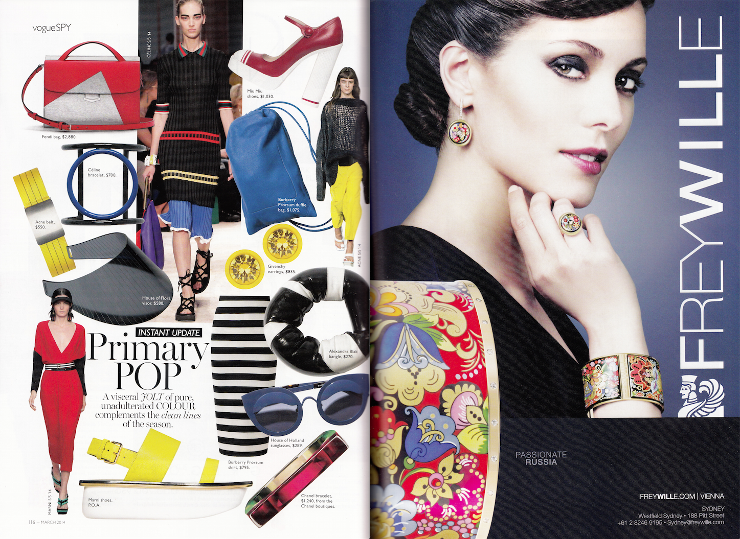
Vogue magazine


2. Street Advertising
Bett Gallery, Hobart

3. A website
Dark Mofo website


4. your choice
MADE Quarterly magazine


D3 - Learning Activity 02 - Black Squares
Part A
The aim of this exercise is to understand the difference of depth, space and dimension. Words are used to communicate and convey meaning through simple shapes and space. We were meant to sketch some ideas in the small squares above the main template....I work big and like to spread myself out. These squares were too small for me to doodle in. I found it easier to sketch out some ideas on paper first to consolidate my ideas. I saw the solution visually and basically refined the first idea that I had.
By using up to four flat black squares, which could be of any size, we had to create an image (shape) to express the meaning of each of the following six words:
- order
- increase
- bold
- congested
- tension
- playful

Part B
We had to find magazine or business cards that demonstrate each of the six categories above:
1. order

Abode Living catalogue


2. increase


Juun.j in Another Man


6. playful

Nation State in Frankie


D3 - Learning Activity 01 - Typographical Portrait
In this exercise we had to visualise the characteristics of this personality using only the type of our own name and choose an appropriate lettering style. we had to consider the style, weight, size, letter spacing and case of the letter characters. It was good to pick up a pencil for this assignment. A bit of rubber grubbiness but it was fun! The image had to be:
- scanned as A4 vertical
- 72 dpi
- RGB mode
- Open in Photoshop and change the image size to 700 pixels wide
- save as a jpeg-myname.jpg
- file size - under 2mb

No comments:
Post a Comment